Reporting Dimension results
The Dimensions page allows you to view your dimensions data in various ways. More information about dimensions is available here.
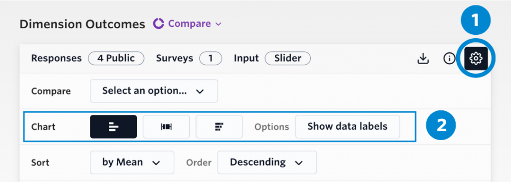
There are three different chart types to choose from to visualise your data:
- Slider chart
- Range chart
- Stacked chart
To choose your chart, select the ‘Gear’ icon on the top corner and scroll to the ‘Chart’ section.
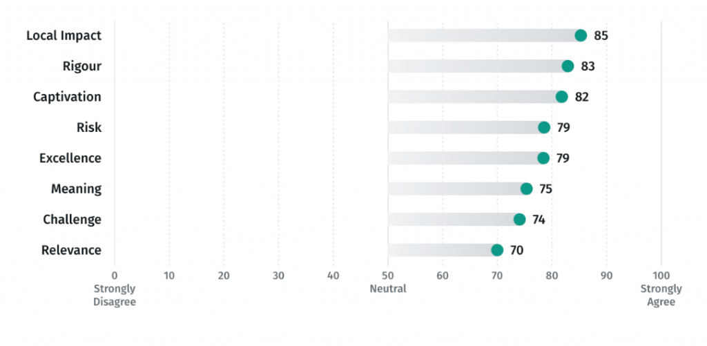
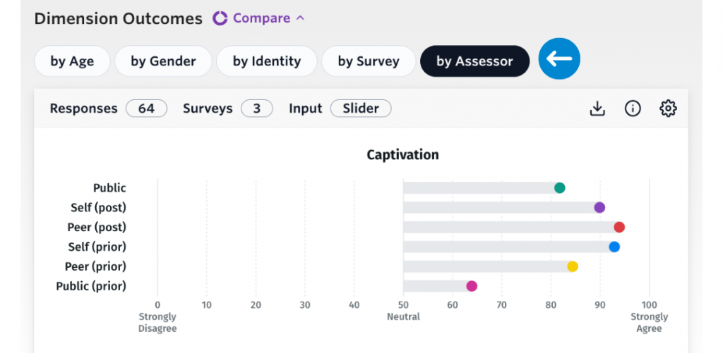
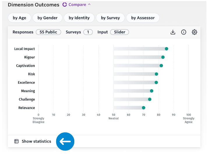
Slider chart
The slider chart that visualises the average results for each dimension and mirrors the slider input method for dimension questions. The data labels show the average result between 0 (strongly disagree) to 100 (strongly agree). This result is represented in the Statistics Summary table on the same page as Average (mean) and is the default way to report results for dimensions.
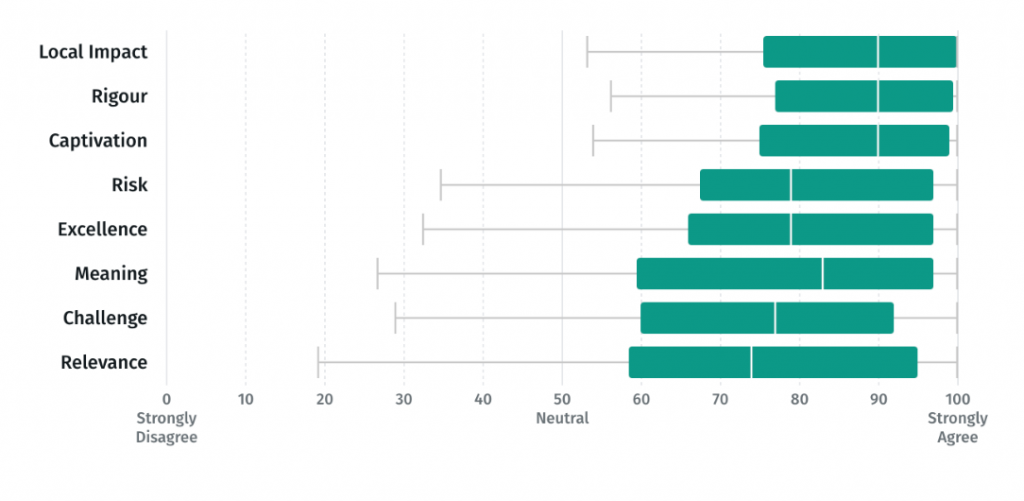
Range chart
The range chart (i.e., box and whisker chart) shows the range of responses for each dimension. The box area of the chart shows the ‘interquartile range’, which is a distribution of the middle 50% of responses. This is area on the slider where most responses typically fell. The line areas of the chart (i.e., the whiskers) represent the the interquartile range multiplied by 1.5. Represented inside the interquartile range is the median result, which is the middle result of all responses. Smaller ranges indicate similarity in agreement between respondents, whereas larger ranges indicate a wider spread of responses.
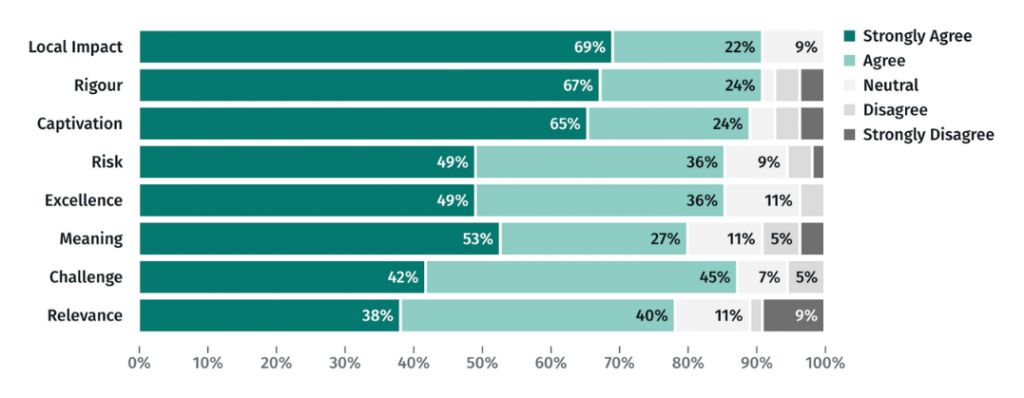
Stacked chart
The stacked bar chart shows the stacked level of agreement for each dimension. Each colour represents which proportion of respondents fell within five position on the slider scale. This chart is appropriate for if you want to report the percentage of respondents that agreed or strongly agreed with a dimension statement.
If you are unsure of which chart type you are looking at, click the information icon for a definition. You can also compare dimension responses by various factors. More information about this feature is available here.
A common way to compare dimension results are by ‘Assessor’. For users that want to see the differences between respondent type and time period, the Assessor Comparison Preset is the most appropriate way to do so. Note to compare by respondent type and time period, surveys need to be configured with the appropriate time period. More information about configuring surveys is available here.
Statistics and Margin of Error
At the bottom of the dimensions chart is a ‘Show statistics’ button. This button reveals a summary statistics table that displays all the dimensions in an evaluation or survey, alongside the number of responses, the mean average results, the confidence interval and the margin of error.
The confidence interval indicates the range within which we can expect the true population mean average to fall, based on the sample data. It is calculated by adding and subtracting the margin of error from the sample mean. The Margin of Error, on the other hand, is a measure of uncertainty that represents the amount by which we could expect the sample mean to vary from the true population mean.
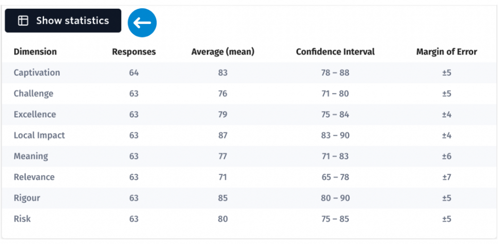
The Margin of Error is calculated at a 95% confidence level. A margin of error of +/-2 suggests that we can be 95% confident that if you surveyed the entire visitor population, the average result for that dimension statement would be likely to fall within 2 points above or below the average result generated by the sample.
A Margin of Error is calculated by the system for each dimension using the sample size, the standard deviation and the standard error. When respondents typically give the same answer, the Margin of Error will be smaller. When respondents give vastly different answers, the Margin of Error will be larger. You can generally reduce your Margin of Error by increasing the sample size.