
What do pie, donuts and waffles have in common? They are all types of parts-to-whole charts! Along with making comparisons, visualising what things are composed of, is one of the most important applications of data visualisation. Examining these “parts-to-whole” relationships can provide insight into demographics, budget allocation, levels of agreement, and more.
If you’ve been following along with our How to visualise your data series, you’ll know the kind of data, along with the intended message you want to convey (the so, what?), provides a guide on which chart to use. Parts-to-whole relationships are an excellent example of applying this principle – these visualisations work for data that can be grouped into categories, where our aim is to see how much of the total each category makes up. In addition, certain types of visualisations in this domain require that the categories sum to some fixed value – often 100% (e.g. pie charts, donut charts, mosaic plots), while others can show the parts-to-whole relationship along with a second encoding channel which acts to relax this requirement (e.g. stacked column/bar charts). Hopefully, this will make sense after running through a few examples!
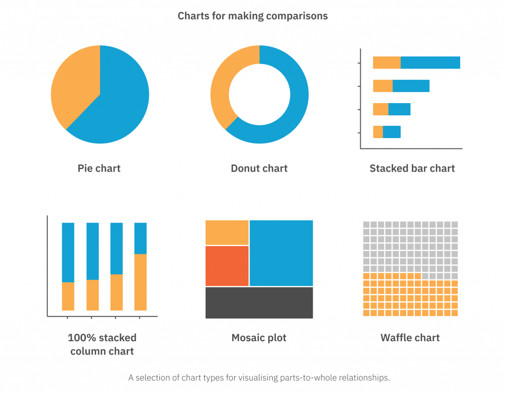
Pie and Donut Charts
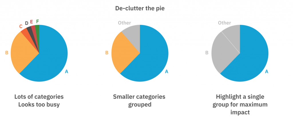
Perhaps the most well known parts-to-whole chart type is the simple “pie” chart. However, it is also one of the most maligned! There are strong visual perception arguments (backed by research) demonstrating that humans find it very difficult to make comparisons between the segments in a pie chart, in part because the area of a circle is quite visually misleading (a circle of 2x the area will only be ~40% “bigger” in terms of the diameter), and in part, because there are actually two visual channels being used here: segment area and segment arc angle.
However, if the ‘so, what?’ requires making comparisons, we know that a bar or column chart would be much better suited. What the pie or donut chart really offers is a quick visualisation of the parts-to-whole relationship. And while there may be better ways to visualise this, clients often like what they are familiar with, and if that means pie charts then let them eat pie!
That being said, in order to avoid incorrect interpretations being drawn from pie or donut charts I like to follow a few general guidelines:
- Try to keep the number of categories very low, preferably less than 3. If there are more, grouping into an “Other” category can work.
- Have a logical order to the categories; some data visualisation textbooks will recommend having the largest segment at the top going clockwise, then the second-largest at the top going anti-clockwise, then the remaining categories in between these two. This way, the two primary categories both have a vertical arc-line, and so the arc-angle of each can be perceived more accurately. However, personally, I find this layout can be slightly confusing, and often opt for the segments to be ordered decreasing by size going clockwise.
- If there is one category that is the main purpose of the ‘so, what?’ insight, colour all other segments grey and use a single “highlight” colour to draw attention to this category.
Stacked Column/Bar Charts
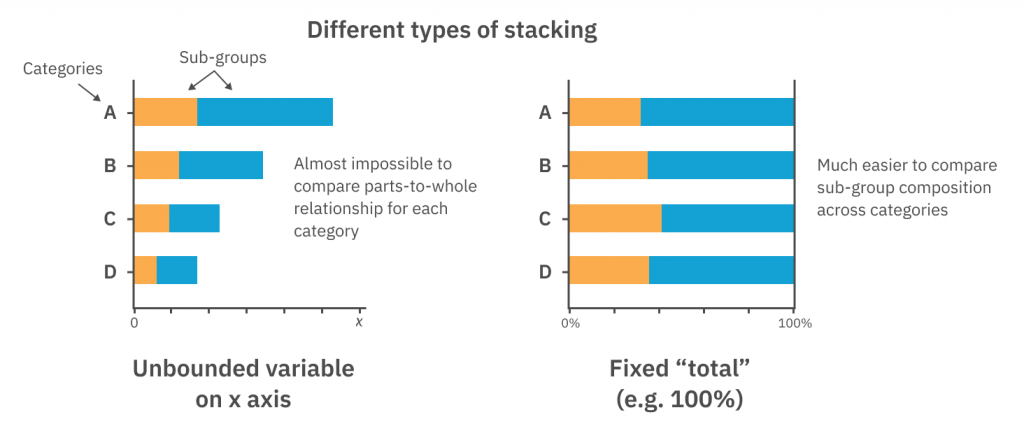
Column and bar charts were introduced in the previous post on making comparisons. There are two types of bar/column charts we will talk about here, and they are slightly different, but in a very critical way.
First, let’s talk about the “100% stacked bar/column chart”. As the name suggests, this requires that the sub-groups all add to some “total” value that is identical across all primary categories. This is most typically 100% (hence the name), but in theory, it could be some numerical value that is fixed and constant – e.g. “the total number of shows in the festival”. These charts are an excellent option for the comparison of parts-to-whole compositions across multiple categories. You can think of them as “comparative pie charts” – in any situation where you have multiple pie charts and are trying to compare between them, consider opting for a 100% stacked bar/column chart instead.
If the sub-groups don’t “add to 100%” (or some fixed value), then we cannot squash them into a 100% stacked bar/column chart. However, we can place this second variable along the numerical axis, so that the sum of the sub-groups is no longer restricted. This has the effect of making all of the bars/columns different lengths, and so we lose the ability to easily compare the parts-to-whole compositions. Personally, I find these chart types very hard to read, they seem like they are jamming extra information at the expense of rapid interpretability. In most cases I would recommend splitting the data into two separate charts with clear intentions and messages: a bar chart to compare the “sum” numerical value, and a 100% stacked bar to compare the (relative, percentage-based) sub-group compositions across the different categories.
Mosiac Plots and Waffle Charts
Mosaic plots use the area to denote the parts-to-whole relationship in the same way as a pie chart, although in this case, it is a square (the “whole”), made up of lots of smaller squares (the “parts”). As with pie charts, these are useful for quickly gauging the dominant contributors to the whole, but are not designed for making detailed comparisons between the “sizes” of each sub-group.
If there is a fundamental conceptual “unit” that makes up the data, a waffle chart can be a nice, visually appealing way to represent parts-to-whole relationships. For example, waffle charts might be used to visualise population demographics, where each “unit” represents 10,000 people. We then would create a shape (usually a square) composed of the total number of “units” that would represent the entire population and apply a colour to the proportion (the parts-to-whole) we want to visualise. For a simple example that’s not going to get confusing at all, see the waffle chart below of waffles sold at my uncle’s waffle cart, showing the popularity of each flavour.
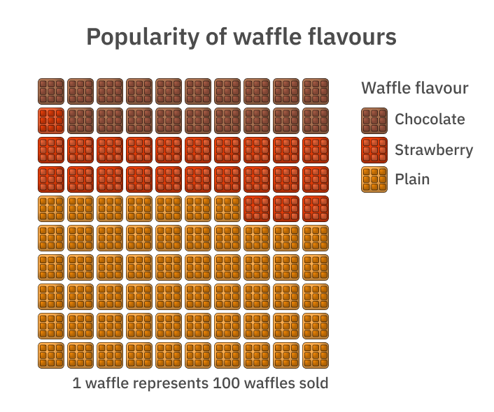
Yes, my uncle really does have a waffle cart; however, all data is completely made up.
That’s it for our guide to visualising parts-to-whole relationships following the principles of applying the ‘so, what?’. Next up in the series: Data over time.
Culture Counts provides evaluation solutions for measuring impact. Are you interested in our data analysis and reporting solutions? Contact the Client Management team for a friendly chat.
References:
Courtney, H., Kirkland, J. Viguerie, P. 1997. ‘Strategy Under Uncertainty’. Havard Business Review. Accessed 31 March 2020. https://hbr.org/1997/11/strategy-under-uncertainty


