
Visualising data is about more than just picturing numbers; it is about telling a story.
When you are dealing with evaluation datasets, including surveys and question responses, there are many rich and compelling stories to be told.
Culture Counts big dataset, like most data, is stored in a space-efficient database of raw numbers. But to deal only in tables of raw numbers is to completely isolate portions of the human brain associated with creativity and insightfulness – the portion that views, analyses and interprets information visually.
Tables of raw numbers are invaluable as an input for analysis but they are an unfinished product. They are often so vast and fragmented that the insights, patterns and anomalies of the information become obscured.
This fact can be illustrated by examining just two numbers:
117.4K to 2.32M
Here, in our tiny dataset of two numbers, we can see that the second number is bigger than the first. Trying to picture the scale of the difference isn’t so easy though. Let us take these two numbers and view them as a simple bar chart.
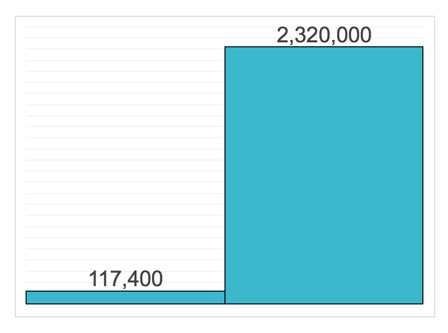
This chart is not only quicker and easier to interpret, but it is also more memorable. This plays into our innate ability to picture and remember the world we live in visually.
The simple example above presents a strong case for the additional value and insight that can be gained from data visualisation. When visualising a large dataset, we can begin to see patterns, make observations and draw insights that come together to tell a story.
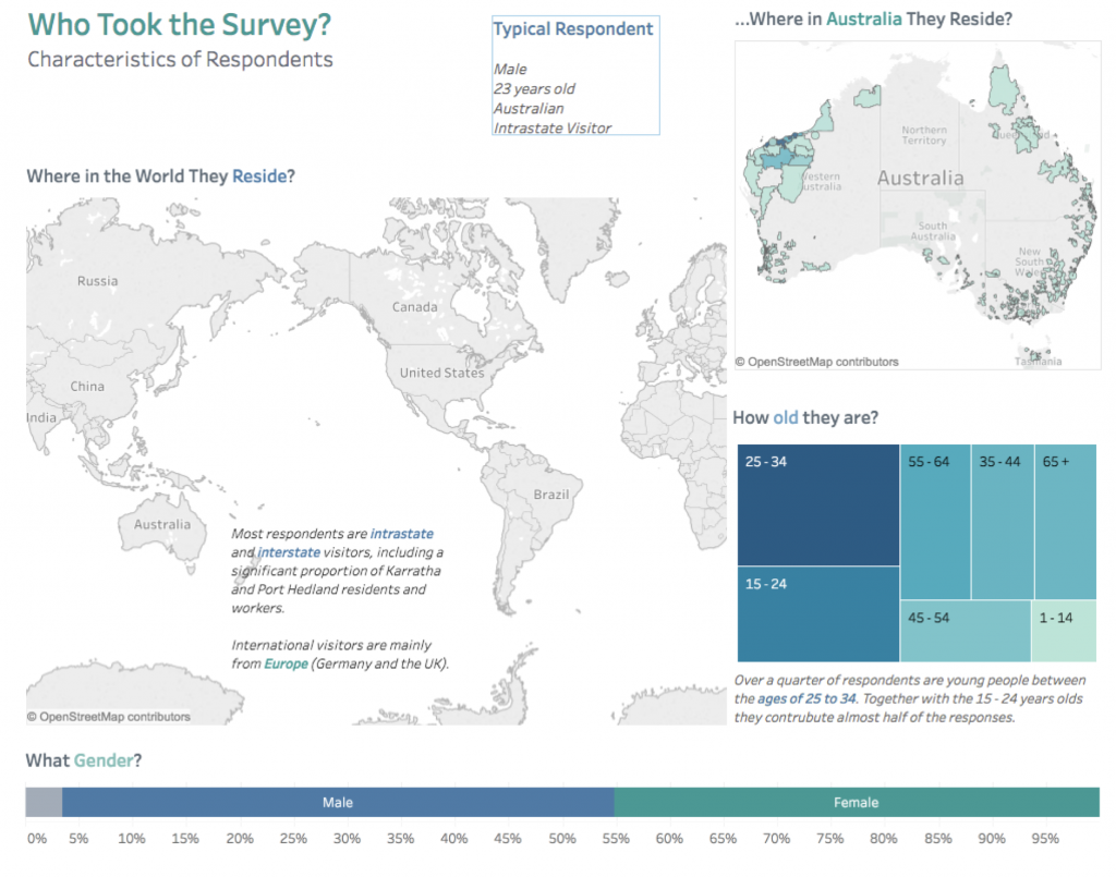
New tools for visualising data allow us to identify data insights and examine trends faster and more accurately than ever before. For our clients, this means a targeted investigation into outcomes achieved and in turn a greater understanding of the value generated by cultural events. These findings can be visualised in the form of an interactive dashboard, such as the one prepared below using the data visualisation package Tableau.
These data visualisations frame easily comparable and relatable insights, while still maintaining the richness of full evaluation datasets. Correctly configured, data visualisations speak in a language that specifically targets the research and funding aims of our clients.
How well does your target audience respond to your production company’s new show in each state? And how does that compare to what you actually expected? Data visualisation allows us to add extra dimensionality and cross-comparability to the questions our clients most often seek answers for.
The visualisation of complex evaluation datasets can reveal new insights hidden in the numbers – and great data visualisation can be an art form in itself.


